27 Side Table Design Rules Every Stylish Home Actually Follows
Disclosure : This post may contain affiliate links or paid partnerships. I may earn compensation if you click a link or make a purchase, at no additional cost to you. See my disclosure for more info.
Good design is not magic. It is method.
The same principles that make luxury hotel lobbies feel effortlessly composed apply to the twelve square inches of your side table. And once you understand those principles, you can apply them anywhere.
Most homeowners treat the side table as an afterthought — a surface where things accumulate rather than a surface that is deliberately composed. The result is a living room that feels almost right but never quite finished.
These 27 rules close that gap. They are the same guidelines professional stylists follow when working on high-end interiors — and they are just as applicable to your home.
No exceptions. No workarounds. Just the rules, and why they work.
Rules 1–4: Build Your Foundation
1. Never style on top of clutter. Always begin from zero.
This is the foundational rule, and it applies without exception.
Professional stylists do not work around existing mess. They clear every surface, evaluate each object independently, and return only what earns its place. Apply this habit to your own table before a single decorative decision is made.
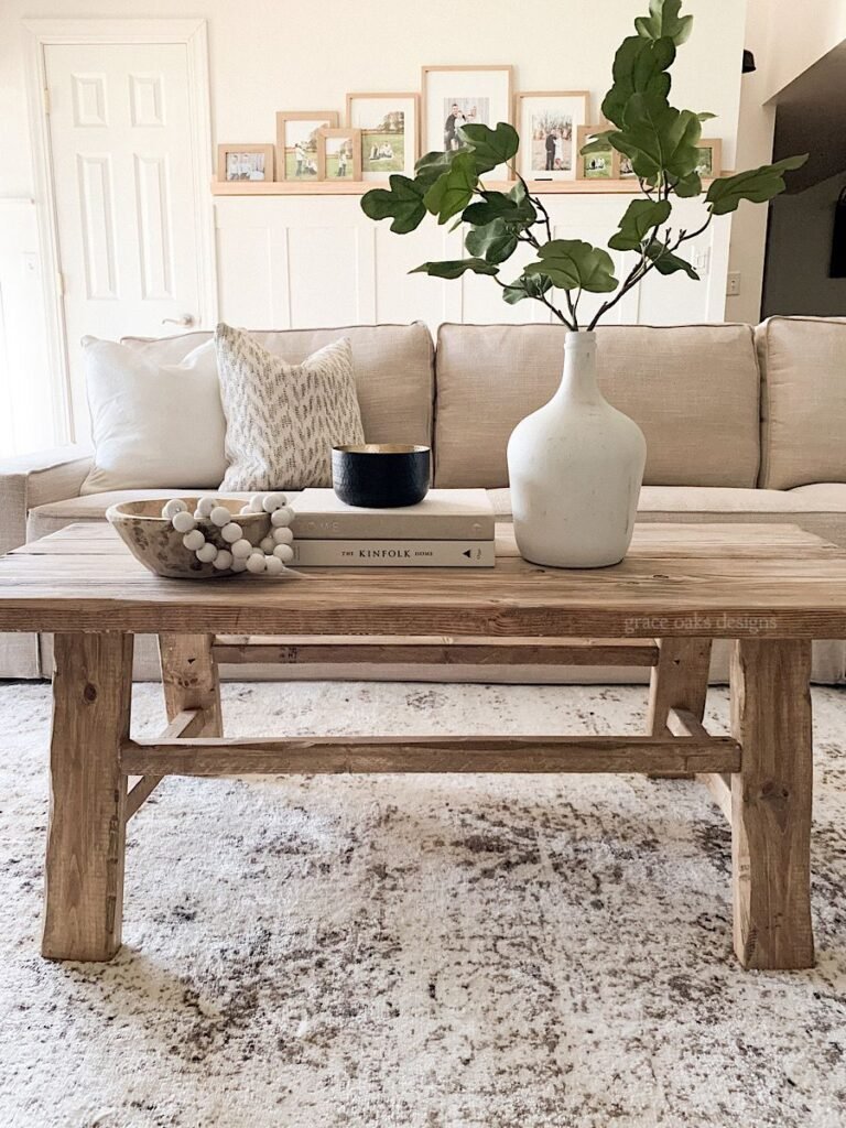
2. Use triadic grouping as your default compositional structure.
The rule of three is not a stylistic preference — it is a perceptual principle rooted in how human vision processes grouped information.
Three objects of differentiated heights form a visually resolved composition. The eye moves between them in a triangular path and registers the result as complete. Four or five objects demand more cognitive work. Seven become noise.
3. Establish a clear vertical hierarchy across your arrangement.
A flat arrangement is a compositional failure regardless of how beautiful the individual pieces are.
Establish a tall element, a mid-height piece, and something low. This vertical range creates the movement and visual interest that keeps a composition engaging. A curated book stack is among the most efficient tools for building height without additional purchases.
4. Identify your primary focal element before placing anything else.
Every resolved composition has a visual entry point — one dominant element that draws the eye first and anchors everything else.
Choose your hero — whether a sculptural vase, a bold lamp, or a striking clock — before adding supporting pieces. When every object demands equal attention, the composition becomes incoherent. Lead deliberately.
Rules 5–7: Command the Light
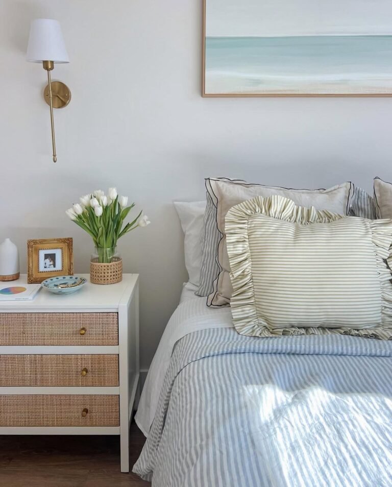
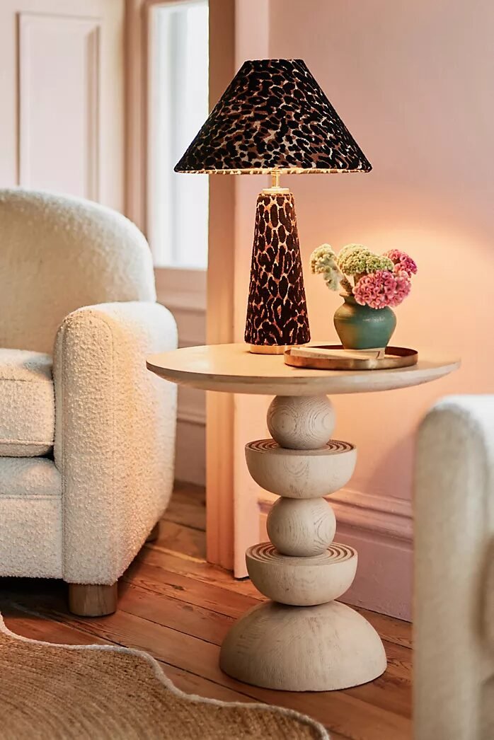
5. Introduce a table lamp to layer your room’s lighting intelligently.
Ambient overhead illumination is a baseline — it fills a room, but it does not animate one.
A warm-spectrum table lamp on your side table introduces what designers call accent lighting: a secondary source that creates depth, shadow variation, and an atmospheric warmth that transforms how the whole room is experienced. This is architectural thinking applied to a small surface.
6. Eliminate cord visibility with a rechargeable solution.
Visible cords represent a compositional failure, not an inconvenience.
A cordless LED lamp removes this element entirely. It provides excellent ambient output, repositions freely without outlet constraints, and maintains the uninterrupted surface line that any well-composed side table requires.
7. Add a candle element to introduce organic light variation.
Electric light is static. Candlelight moves.
A candle beside a lamp introduces the kinetic quality of a living flame — a variable light source that adds both visual warmth and sensory depth to the arrangement. Experienced stylists rarely complete a side table without one.
Rules 8–10: Engineer the Layers
8. Deploy stacked volumes as a deliberate height-building device.
The professional application of books extends well beyond the coffee table.
A vertical stack of two or three volumes functions as a plinth — elevating whatever rests upon it and creating architectural height within the arrangement. The books themselves contribute to the palette through cover color and spine design.
9. Treat book spines as active color palette elements.
Designers treat every visible surface as a deliberate color decision. Book spines are visible surfaces.
Select volumes whose cover tones support your room’s established palette. Where alignment is difficult, reverse the books to present a clean neutral edge. Either approach is more intentional than arbitrary selection.
10. Use a small tray to define the compositional boundary of your arrangement.
A tray performs a critical function: it creates a visual perimeter that transforms disparate objects into a single cohesive composition.
Within a tray, five objects read as a curated scene. Without it, they read as accumulation. The deliberate contrast of a round tray on a square table — or vice versa — introduces formal tension that sharpens both elements.
Rules 11–13: Introduce Organic Elements
11. Always include at least one living organic element.
A small potted plant, a stem in a bud vase, or a compact succulent introduces what designers call biological irregularity — the natural asymmetry and organic color that manufactured objects cannot produce.
Living material breaks the rigidity of hard-object compositions and brings a vitality that even the most beautifully crafted ceramics cannot replicate. Include it as a rule, not an option.
12. Use preserved botanicals where consistent presentation is required.
For arrangements requiring low-maintenance organic presence, dried botanicals are the professional default.
Dried eucalyptus or stems of pampas grass maintain their character for months without intervention, delivering the textural warmth of live plant material without ongoing care requirements.
13. Place a found organic object for sculptural contrast.
The unexpected natural element is a hallmark of sophisticated styling.
A piece of weathered driftwood or a sculptural branch introduces raw, unprocessed form alongside manufactured objects. The contrast signals curatorial discernment — an eye that selects for character rather than convenience.
Rules 14–16: Work With Texture and Material
14. Always establish deliberate material contrast within the arrangement.
A monochromatic material palette reads as flat regardless of individual piece quality.
Pair a ceramic vase with a brass candle holder. Place glass adjacent to a woven basket. The textural dialogue between contrasting materials generates the visual depth that a single-material arrangement cannot achieve. This is the rule behind every richly layered surface.
15. Introduce textile elements to modulate the arrangement’s temperature.
Hard surfaces read cool. Textiles read warm. The interplay between them creates balance.
A woven coaster beneath a vase. A folded linen as a base layer. A macramé plant hanger at the table’s edge. These soft elements lower the visual temperature of the arrangement and invite tactile engagement that purely hard compositions cannot generate.
16. Deploy one metallic accent as a light-reflecting element.
Metallic surfaces function as light multipliers within a composition. They capture ambient light and redistribute it, lifting the entire arrangement.
One element — a brass picture frame, a brass-based object, a copper dish — achieves this. Multiple metallics compete rather than collaborate. One is the rule.
Rules 17–19: Design With Intention
17. Include one object of genuine autobiographical significance.
The most memorable interiors are legible — they communicate something authentic about the people who inhabit them.
An heirloom piece. A travel acquisition. A work by a local maker. That single authentic element transforms a styled arrangement into a personal statement and generates the kind of conversation that mass-produced objects never prompt.
18. Use a leaned frame rather than hung art to create an informal gallery effect.
Mounted artwork signals permanence. Leaned artwork signals ease and mutability.
A 4×6 or 5×7 framed print rested against the wall behind the side table creates layered depth that hung pieces rarely achieve. It is effortlessly adjustable, seasonally swappable, and requires no installation.
19. Provide a designated receptacle for daily-use objects.
The side table functions as a transitional zone. Objects will land there. Design for this reality rather than against it.
A refined small dish — marble, hand-thrown ceramic, hammered metal — gives keys, rings, and glasses a designated position that integrates rather than disrupts the arrangement. Function becomes part of the composition.
Rules 20–22: Respect Proportion
20. Treat negative space as an active compositional element, not empty surface.
The most common error in surface styling is filling available plane. Resist it completely.
Open surface area is not wasted — it is visual rest. Reserve at minimum one-third of the table as empty. This breathing room increases the apparent weight of every object on the surface and signals compositional confidence.
21. Proportion every object to the scale of the table and the room.
Scale misjudgment is among the most visible errors in surface composition.
An oversized object on a petite table overwhelms. An undersized grouping on a generous surface reads as neglected. Read the table in relation to surrounding furniture. Choose objects whose physical scale is appropriate to that context.
22. Apply the 1.5x lamp shade rule to constrain vertical reach.
No element should exceed one and a half times the height of the lamp shade.
This constraint prevents top-heavy compositions and maintains the visual stability any resolved arrangement requires. It is one of the most reliable guidelines in professional surface styling.
Rules 23–27: Finish With Precision
23. Engage olfaction as a deliberate design layer.
Sophisticated environments communicate across sensory channels simultaneously.
A scented candle or a reed diffuser adds an olfactory dimension that operates below conscious awareness but profoundly shapes how a space is experienced. Visitors register comfort before they identify its source. That is seamless, multi-sensory design.
24. Execute one seasonal object rotation per quarter.
Static arrangements become invisible. Regularly refreshed arrangements remain noticed.
Replacing one object per season — a botanical in spring, a shell in summer, a warm candle in autumn, a spare branch in winter — maintains currency without requiring a complete restyle.
25. Elevate key objects on pedestals to establish clear visual hierarchy.
Height implies importance. Even marginal elevation changes how an object reads within a composition.
A marble coaster beneath a candle. A small wooden base under a vase. These pedestals create a hierarchy that signals which object carries the most compositional weight. The cost is minimal. The effect is immediate and professional.
26. Edit the arrangement monthly with disciplined objectivity.
Professional stylists do not set and forget. They return, reassess, and revise.
A monthly edit removes objects that have grown stale and prevents the accumulation that gradually converts a curated surface back into clutter. The best arrangements are maintained, not merely made.
27. Always assess the final composition from the room’s primary viewing distance.
A composition styled at close range must hold at the distance from which the room is actually experienced.
Step to the opposite wall. Sit in the primary seating position. View from the doorway. The arrangement must read as cohesive, intentional, and proportionate within the full context of the room. If it does, the work is complete.
From Rules to Results
The distance between understanding these rules and applying them is exactly one decision: to begin.
Most people read, acknowledge, and return to their unchanged side table.
Don’t do that.
Select three rules from this list. Apply them this evening. The materials you need are very likely already in your home.
The difference between a living room that looks designed and one that looks assembled is not a budget or a professional consultation. It is the cumulative effect of deliberate, rule-based decisions made about small things.
Your side table is one of those small things. And as every designer knows — the small things define the room.
When someone walks into your living room and says, “This space feels so considered” — you’ll know precisely which 27 rules produced that response.