Green Front Door Colors That Make Your Home Look Polished and Put-Together
Disclosure : This post may contain affiliate links or paid partnerships. I may earn compensation if you click a link or make a purchase, at no additional cost to you. See my disclosure for more info.
There’s something off about your front door.
You’ve known it for a while.
Every time you come home, it catches your eye for the wrong reasons. The color feels tired. Generic. Like a decision someone made years ago without caring much about the outcome.
You’ve looked at inspiration photos. Scrolled past beautiful homes. And somehow you still can’t quite land on the answer that feels right for yours.
Your front door matters more than most people acknowledge. It anchors the entire exterior. It tells visitors, in a single glance, whether this is a home worth noticing.
Right now, yours is missing that signal.
You’re leaning toward green. Something alive. Something that reads intentional rather than accidental. Something that earns a second look without demanding it.
The difficulty is that green isn’t one color. It’s hundreds. And the wrong choice — too bright, too muddy, too cool — can undermine the whole facade instead of elevating it.
That’s not the outcome you’re working toward.
So let’s get specific. The best green front door colors for real homes, with real exteriors, are right here — along with the reasoning that makes each one actually work.
The Real Reason Green Is Such a Powerful Front Door Color
Before diving into individual shades, it’s worth understanding what makes green perform so consistently as a front door color in the first place.
The human visual system processes green with less effort than any other color. It occupies the midpoint of the visible spectrum, which means it registers as balanced and naturally restful.
That’s not aesthetics — that’s biology.
But what makes green especially effective for curb appeal is its adaptability.
Green is one of the very few accent colors that pairs well with almost every exterior material on the market. Aged brick? Outstanding. Natural stone? Beautiful. Painted shingles? Absolutely. Bright white siding? Iconic.
Other bold colors struggle with that range. Blue can feel cold in the wrong light. Red can fight with warm exteriors. Yellow can tip from cheerful into overwhelming.
Green manages to stand out without standing apart.
There’s an emotional dimension to it as well. Green is culturally and psychologically linked to growth, renewal, and hospitality. A green front door communicates — before anyone sets foot inside — that this home has something worth experiencing.
Remarkable, for a pint of paint.
Now, to the shades that actually earn their keep.
1. Sage Green — Poise Without Pretension
For homeowners who favor subtle sophistication, sage green is almost always the right call.
It carries gray undertones that prevent it from skewing too earthy or cottage-like. The result is a shade that reads as cultivated without being cold.
Sage pairs particularly well with warm-white trim, cream molding, and textured natural materials. It belongs on farmhouses that have aged into something better than new. On coastal properties that have absorbed decades of salt air.
Its strongest performance comes alongside warm-toned masonry. If your brick or stone has golden, sandy, or blush-pink leanings, sage will complement them without competition.
Something to watch: Intense sunlight flattens sage. South-facing doors in strong sun climates may benefit from going a half-step darker than what initially appeals. Paint consistently dries lighter than the chip suggests.
Every time, without exception.
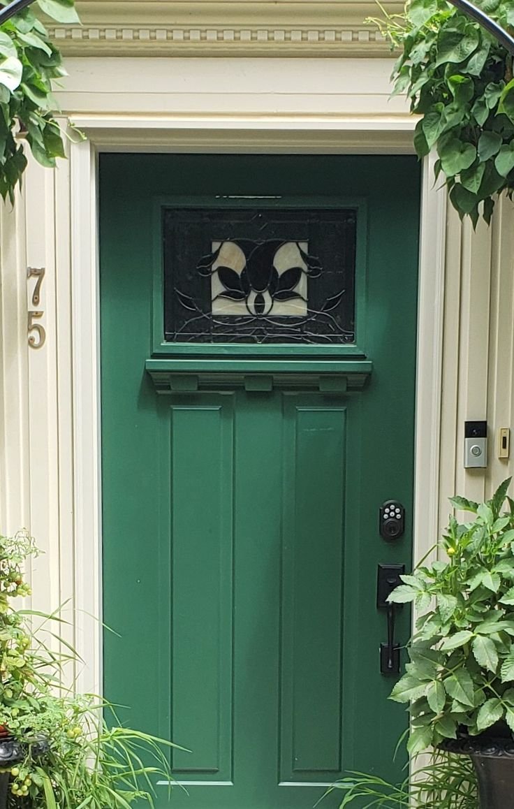
2. Hunter Green — Proven, Refined, and Timeless
Hunter green has a track record that no other door color can match.
It has defined the entryways of Georgian manors and Craftsman bungalows alike. It works on traditional homes. It works on sharp, modern builds. It works because it transcends trends entirely.
The reason is that hunter green behaves more like a dark neutral than a statement color. It has the depth of black with a warmth that black lacks. It has the richness of deep navy without the coldness.
A hunter green door with polished brass hardware is one of those pairings that looks as though it required a professional designer, even when it didn’t.
Brass door knocker. Brass kick plate. Brass house numbers.
Brass and hunter green together are reliably exceptional.
The limitation to know: If your exterior runs to cool blue-gray tones, hunter green’s yellow-based undertones can create an awkward visual tension. For cool-toned homes, read on — there’s a shade ahead that will serve you better.
3. Olive Green — Organic, Settled, and Deeply Grounded
Olive green doesn’t advertise itself. That’s the whole point.
It walks the line between green and brown, which gives it a naturalistic, rooted quality that most colors can’t replicate. Olive doesn’t grab attention. It draws it slowly, from the people who look closely.
On properties embedded in natural surroundings — tree-lined lots, stone garden paths, desert-adapted plantings — olive green is genuinely spectacular. It allows the door to feel continuous with the landscape rather than placed in front of it.
It also performs reliably alongside dark exterior schemes. Slate-gray siding, charcoal metal roofing, dark wood cladding.
Where other greens start to feel misplaced against very deep tones, olive bridges the contrast gracefully. It has enough color to read as alive, but enough restraint to feel composed.
One caveat: In low-light or heavily shaded conditions, olive can tip toward muddy. If your entry is recessed or covered by a substantial overhang, test your sample specifically in that shade. What reads as sophisticated in the showroom can look flat in shadow.
4. Emerald Green — Confident, Saturated, Unforgettable
If the goal is maximum visual impact, emerald green delivers without negotiation.
It doesn’t ease into a scene. It takes over. And for the right home, that’s exactly what’s needed.
Emerald is a full jewel tone — deep, richly saturated, immediately luxurious in feel. It transforms the most ordinary entryway into something that reads as curated and deliberate. Think velvet. Think depth. Think the difference between a room that’s furnished and one that’s designed.
White trim is mandatory. Crisp, bright white against the depth of emerald produces the contrast that makes people stop and actually look at a house.
Hardware matters at this level of boldness. Matte black handles and hinges give emerald a sharp, contemporary edge. For something with more history, antique brass leans into a richer, more classical tone.
Where emerald works best: Homes with genuine architectural features to highlight. Deep-set entries, paneled sidelights, carved molding, or a well-crafted paneled door will allow emerald to do what it does best — draw the eye to structure and detail.
A flat, featureless door in emerald can feel heavy rather than rich. If that’s your situation, consider starting with a new paneled door, then applying the emerald. The combined effect will be transformative.
5. Forest Green — Solid, Permanent, and Quietly Impressive
Forest green exists in its own category, separate from both the drama of emerald and the brightness of hunter.
It reads darker, more deliberate, and more grounded than either. Less like a design choice and more like a considered statement about what this home stands for.
Forest green projects permanence. It communicates that this property has roots — that it was built to last, maintained with care, and intended to remain. That kind of visual authority is rare.
Traditional and Colonial-style homes benefit most from forest green. Against ivory trim, black shutters, and a paneled door design, the overall picture is the kind of curb appeal that remains attractive for decades rather than seasons.
And beyond aesthetics, research into buyer perception consistently shows that deep, rich greens signal care and thoughtfulness in ways that lighter colors don’t. A forest green door may genuinely move the needle on how your home is perceived by anyone viewing it from the street.
That’s not a small thing when you consider that curb appeal is often the first impression that drives every impression that follows.
6. Mint Green — Cheerful, Fresh, and Surprisingly Refined
Pulling this one off takes some confidence.
Mint green is airy, optimistic, and vibrantly fresh. It reads like a breath of clean air — light, welcoming, and unmistakably cheerful.
Is it the right choice for every home? Honestly, no.
But in the right context, mint is seriously impressive.
It thrives on beachside properties, Caribbean-inspired homes, and neighborhoods where character is the dominant design philosophy. It also works remarkably well on mid-century modern architecture with clean lines and restrained trim.
The secret to making mint feel refined rather than playful? Simplicity in everything surrounding it. White or very pale gray exterior. Minimal hardware, minimal accessories. Allow the door itself to be the single point of color.
Load too many elements around a mint door and the result tips from fresh into frenetic. For the homeowners who want elegance, that means editing everything else until the door stands alone.
7. Eucalyptus Green — Soft, Cool, and Entirely Modern
Eucalyptus green has quietly become one of the most sought-after exterior accent colors among architects and residential designers in recent years.
It sits between sage and mint in the spectrum — borrowing sage’s softness while introducing a cooler undertone that gives it a thoroughly contemporary feel.
For homes with cool-toned exteriors — pale gray, slate, crisp white — eucalyptus green reads as though it was developed for the specific house it’s on. The harmony is immediate.
It pairs naturally with matte black hardware, concrete planters, and modern house numbers. If modern-organic is the design language you’re working in, eucalyptus may be the most coherent front door choice available.
One styling detail: Frame a eucalyptus door with potted greenery — living plants when possible — and the entry begins to feel like an extension of the garden. The door doesn’t sit in front of the landscape. It becomes part of it. That continuity elevates the whole exterior.
What to Do Before You Open a Single Can of Paint
You’ve found your shade — or narrowed it to two. Before committing, here are the principles that consistently separate front doors people love for years from the ones they quietly regret.
1. Always test paint on the actual door before committing. Swatches in browsers are unreliable. Every screen renders color differently. Order physical samples, paint a large section of the door or a nearby board, and observe that sample over multiple days and in different light conditions.
2. Respect your fixed elements. Roof color, masonry type, driveway material, walkway texture — none of these are changing. Your green needs to work harmoniously with all of them.
3. Take sheen seriously. High-gloss paint and satin paint in the same color are effectively two different products. Gloss amplifies depth and highlights every surface imperfection. Satin strikes the right balance for most front doors — a finish that reads as intentional without becoming a mirror.
4. Don’t ignore the door’s edge. When the door stands open, the edge is fully visible to anyone entering. Painting it the same color as the face is a small step with a significant payoff.
5. Consider year-round performance. A deep green might look magnificent in autumn with a fall wreath at the entry. Make sure it also works with your summer planters in the height of summer. Exceptional front door colors earn their place across all four seasons.
The Door That Represents Your Home Is Still Waiting
You’ve arrived at something many homeowners spend months searching for: real clarity.
You know which shades perform well. You understand which one aligns with your home’s architecture, your taste, and the feeling you want to project.
From here, the choice is simple.
Option one: Delay again. Scroll past more inspiration without acting. Let another season pass with a front door that never quite works.
Option two: Order the sample for the shade that pulled at you while reading this. Tape it up. Step back. Notice how much the exterior shifts.
Because the real insight about painting a front door is this.
It’s not about aesthetics alone. It’s about deciding that your home should communicate exactly what you want it to communicate. That the first impression someone forms — before they even reach the entry — should be the right one.
Fresh. Elegant. Inviting.
That’s the work the right green does.
And now you have everything you need to let it.